SpreadsheetConverter offers you lots of basic graphical widgets that make your web page easier to use and to give it a better appearance. This is the online help page for many of these widgets. 

This is an introduction to the use of widgets in spreadsheets to improve the functionality and appearance of the converted web page. If you haven’t used widgets before, you may want to read the Introduction to using widgets before you continue.

Be aware that most of these widgets have no corresponding representation when used in Excel. Some of them are unfortunately totally invisible in Excel. You have to convert the spreadsheet to web format to see the widget in action.

This page describes the widgets available in the iPhone/Android flavor. There is a similar page describing the widgets in the HTML and Node.js flavors.

Text

Text fields are mainly used in electronic forms to mark the fields where the user will enter data that is not used in calculations, e.g. a name or an address. You insert a Text field widget by clicking the Text widget in the Widgets tab in the task pane.

e”>Screenshot from the iPhone/Android flavor of the Text widget

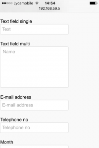
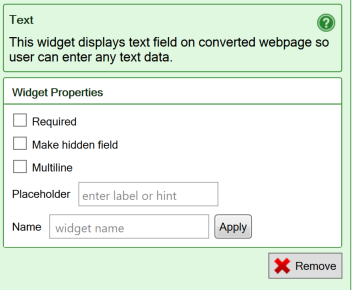
You can then set different properties for the Text field:

  • A Required field requires input from the user. This option is mainly used for electronic forms, where a form must contain a minimum of information to be meaningful. For Text fields, a Required field cannot be empty. If it is, it will not be possible to submit the form.
  • Make hidden field is used when you want a cell to be visible in the spreadsheet, but not in the converted web page. This also allows you to provide information to a form processing script without showing it in the form. As an example, if the link to the form contains a language code (/form.htm?lang=sv), it will be preserved by the form if your form has a text field named lang, and it will be forwarded with the form when the form is submitted for processing. Read more about filling form fields from the link.
  • Multiline is used to give a text area more than one line and to make it scrollable. Use this option only for text fields that you have made sufficiently large in the spreadsheet, e.g. by merging two or more cells. You can achieve the same result by enabling Wrap Text for the merged cell in Excel.
  • Placeholder can contain a text prompt for the field that is visible in the field only when it is empty. As an example, the Placeholder field itself displays the placeholder enter label or hint until you type anything into the field.
  • Name your widgets if you want to pass data into them from the link to the form (see above). For electronic forms, it is also much easier to process the form if all input fields have names. You can name your fields in the widgets or give them cell names in Excel. Widget names can start with numbers or an underscore, which is required when integrating with products like Salesforce.
  • The default value of a Text field is empty. To provide a different default value, enter text into the spreadsheet cell before conversion.

Screenshot of the settings for the Text widget

Learn more

Some of our tutorials partly focus on the Text widget:

Email, Telephone, Month, Week, Number

Special widgets for small touchscreens

When using a mobile device, it can sometimes be difficult to enter data with proper formatting. Many mobile devices offer optimized keyboards for special data types, e.g. a numeric keypad. Some browsers offer data entry templates like date pickers, and even provide syntax validation.

SpreadsheetConverter provides special touchscreen widgets request that the user’s web browser provides additional assistance when entering certain types of input. Your mobile users will be grateful for this help.

Screenshot from the iPhone/Android flavor of the Month and Week widgets

The browser provides the user assistance

A word of caution, though: Although we can request this assistance from the browser, we cannot guarantee that the browser properly supports all input types, or that your users appreciate the help the browser is trying to provide. As an example, the full syntax for an e-mail address is very complicated and you can expect most web browsers to reject unusual but formally correct e-mail addresses such as john.smith(My Johnny!)@example.com or john.smith@[IPv6:2001:db8::1] while cheerfully approving obviously incorrect e-mail addresses such as john.smith.@example.com.

Users don’t like having correct input data flagged as incorrect by poorly tested web browsers. If possible, please test the advanced input types carefully before you implement them.

Examples of touchscreen widgets

  • E-mail address – “.com” and other top level domains may be added to the keyboard by the browser, and the e-mail address may be validated for proper syntax.
  • Telephone number – a special telephone keyboard may be provided by the browser, and the field contents may be validated.
  • Month – a date picker for year and month may be provided by the browser in the default language and regional format set for device.
  • Week – a date picker for year and week may be provided by the browser in the regional format set for device.
  • Number – a numeric keypad may be provided by the browser, and non-numeric content in the field may be flagged.
  • Date – a date picker may be provided by the browser in the default language and regional format set for device.
  • Time – a time picker may be provided by the browser in the regional format set for device.

Properties for the touchscreen widgets

The properties for the touchscreen widgets are the same as for the Text widget. Read more above!

Slider

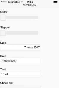
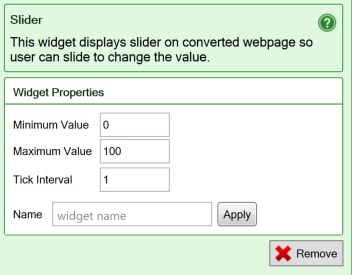
A Slider allows the user to select a value by moving a handle to a particular position on the widget. Sliders are real-time and cause the entire spreadsheet to be continuously recalculated with each new value of the slider as you move it.

Screenshot from the iPhone/Android flavor of the Slider widget

You insert a Slider widget by clicking the Slider widget (value increases from left to right) in the Widgets tab in the task pane.

  • The Minimum value is the value the widget returns at the slider’s leftmost or bottom position, depending on its orientation.
  • The Maximum value is the value that the cell contains when the slider is in its top or rightmost position, depending on its orientation.
  • Use the Tick Interval if you want tick marks along the slider.
  • Name your widgets if you want to pass data into them from the link to the form (see below). For electronic forms, it is also much easier to process the form if all input fields have names. You can name your fields in the widgets or give them cell names in Excel. Widget names can start with numbers or an underscore, which is required when integrating with products like Salesforce.
  • The default value of a slider is whatever value you put in the spreadsheet cell before conversion, or the minimum value.
  • You can assign a value to a slider widget from the link. Use the format /form.htm?example=42. Read more about filling form fields from the link.

Screenshot from the iPhone/Android flavor of the settings for the Slider widget

Learn more

Some of our tutorials partly focus on the Slider widget:

Stepper

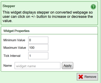
The Stepper widget allows you to easily input small numeric values with just a tap or click on a button.

The worksheet is re-evaluated for each new value, making this a very useful widget when the user is trying to find an optimum value.

Screenshot of an example of the Stepper widget

  • The Minimum value is the lowest value the widget can have. The minus button stops working at the minimum value.
  • The Maximum value is the highest value the widget can have. The plus button stops working at the maximum value.
  • Use the Tick Interval if you want the step to be different from 1.
  • Name your widgets if you want to pass data into them from the link to the form (see below). For electronic forms it is also much easier to process the form if all input fields have names. You can name your fields in the widgets or give them cell names in Excel. Widget names can start with numbers or an underscore, which is required when integrating with products like Salesforce.
  • The default value of a stepper is is whatever value you put in the cell, or the minimum value.
  • You can assign a value to a stepper widget from the link. Use the format /form.htm?example=2. Read more about filling form fields from the link.

Screenshot of the settings for the Stepper widget

Date picker and Time

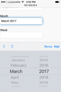
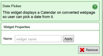
The Date Picker and Time widgets make it much easier for the user to pick the right date and time. The widgets ensure that any date or time set in the widget is valid, and formats it correctly for the recipient of the electronic web form using the regional settings.

Screenshot from the iPhone/Android flavor of the Date picker widget

Date picker

The default value of a date picker widget is the current date. The Date will be formatted according to your computer’s regional settings.

  • Name your widgets if you want to pass data into them from the link to the form. As an example, if the link to the form contains an Excel serial day number (/form.htm?date=20376), it will be preserved by the form if your spreadsheet has a cell named date, and it will be forwarded with the form when the form is submitted for processing. Read more about filling form fields from the link. For electronic forms it is also much easier to process the form if all input fields have names. You can name your fields in the widgets or give them cell names in Excel. Widget names can start with numbers or an underscore, which is required when integrating with products like Salesforce.

Screenshot from the iPhone/Android flavor of the settings for the Date picker widget

Time

The default value of the Time widget is empty. The Time will be formatted according to your computer’s regional settings.

The properties for the Time widget are the same as for the Text widget. Read more above!

Link Image

Save all relevant image links in your spreadsheet or create formulas that can build the right image link dynamically from user input.

linkimage

Use the Link Image widget to select the image that is shown. 

Google Map widget

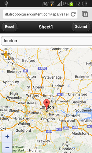
The Google Map widget allows you to use interactive maps in the converted web page.

smartphonemap

Learn more about the Google Map widget. 

Barcode widget

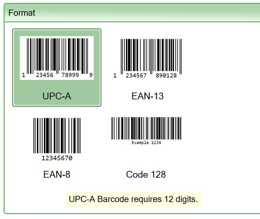
Use the barcode widget to display a barcode from static or calculated content in your web form.

Screenshot of the format settings for the Barcode widget

Learn more about the Barcode widget.

QR code widget

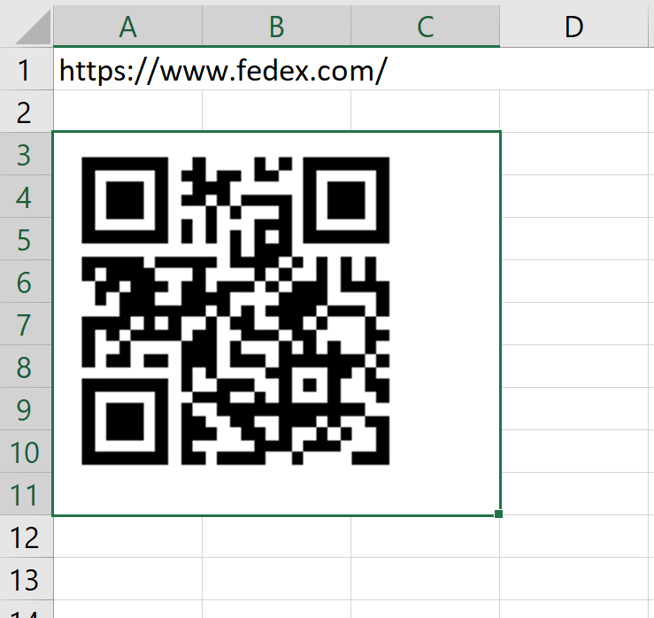
You can display QR codes directly in the web page using the QR code widget.

Screenshot of a spreadsheet in Excel with a QR code widget showing its placeholder

Learn more about the QR code widget.

Check box

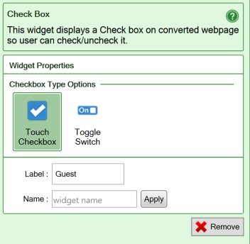
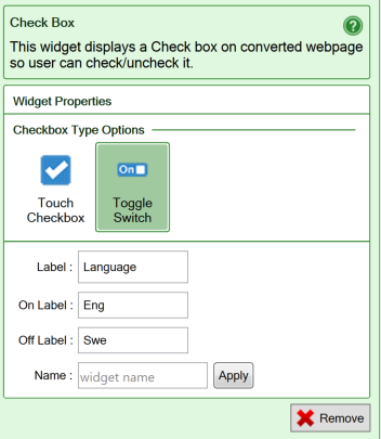
Use check boxes only for statements that must be either true or false, there is no room for doubt, like “British citizen”. The Toggle switch allows you to use any two other names for True and False, e.g. a language pair.

Screenshot from the iPhone/Android flavor of the Checkbox widget

Touch checkbox

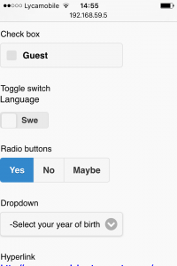
You insert a Check box widget by clicking the Check box widget in the Widgets tab in the task pane. A Check box will provide a true/false value that you can test for in other places in the form, or when the form is submitted for processing.

  • A Touch Checkbox looks like the check mark in the widget’s icon, with a label to the right.
  • The Label for a Touch Checkbox contains a descriptive text, like “British citizen”, so people know when to check the box or not. Clicking on the label will also check/uncheck the check box, providing a larger touch surface on touch screens.
  • After you’ve converted the spreadsheet to a web page, the label appears to the right of the check-box. Unfortunately, the label you set here cannot be shown in Excel.
  • When you add a Touch Checkbox to a spreadsheet, it is initially set to FALSE. When you convert the spreadsheet to a web page, a Touch Checkbox widget will therefore initially be unchecked. If you change the default value by typing TRUE into the widget’s spreadsheet cell before conversion, the Touch Checkbox will be checked when the page is opened in a web browser.

Screenshot from the iPhone/Android flavor of the settings for the Checkbox widget

Toggle Switch checkbox

  • With a Toggle Switch check-box, the Label will appear above a small graphic that is intended to resemble an electric switch. Users can drag the handle or tap one side of the switch to toggle the check-box.
  • When you flip the switch to the right, it returns a TRUE value. Flip it to the left and it sets a FALSE value for the cell.
  • A Toggle Switch has three labels: one that shows what the switch does and one for each state. You can use up to four characters for the On Label and Off Label, like On/Off or Yes/No. The On Label is visible in the switch when the value of the cell is TRUE and the switch is flipped to the right.
  • Only the selected state is visible in the widget, e.g. Show. Your users will assume that flipping the switch will set the opposite state, e.g. Hide.
  • When you add a Toggle Switch check-box to a spreadsheet, it is initially set to FALSE. When you convert the spreadsheet to a web page, a toggle switch will therefore initially show its Off Label, flipped to the left. If you change the default value by typing TRUE into the widget’s spreadsheet cell before conversion, the check-box will be flipped to the right and show its On Label when the page is opened in a web browser.
  • Note: a cell containing a Toggle switch always returns TRUE or FALSE. It does not contain the text from the On Label or Off Label. If you need this function, use a Radio button instead.

Screenshot from the iPhone/Android flavor of the settings for the Checkbox widget as a Toggle switch

Common settings

  • Name your widgets if you want to pass data into them from the link to the form (see below). For electronic forms, it is also much easier to process the form if all input fields have names. You can name your fields in the widgets or give them cell names in Excel. Widget names can start with numbers or an underscore, which is required when integrating with products like Salesforce.
  • You can set the value of a checkbox widget from the link. Use the format /form.htm?example=TRUE. Read more about filling form fields from the link.

Radio button

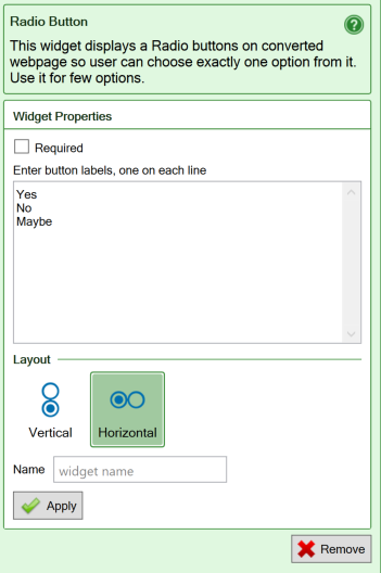
Radio buttons simulate the behavior of old car radios. When one of the buttons is pressed, the corresponding radio station (option) is selected. Simultaneously, all the other buttons pop out, leaving only the selected button in the pushed-in position.

Screenshot from the iPhone/Android flavor of the Radio button widget

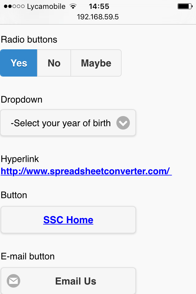
Radio buttons are used to select between a limited number of choices. The good thing about radio buttons is that you see all the available choices. The bad thing is that this may consume a lot of screen space. You insert a Radio buttons widget by clicking the Radio Button widget in the Widgets tab in the task pane. You can then set different properties for the Radio button widget:

  • Required field requires input from the user. This option is mainly used for electronic forms, where a form must contain a minimum of information to be meaningful. For Radio buttons, one of the buttons must be “pressed”. If no button is selected, it will not be possible to submit the form.
  • Button labels are the names for each button. You get one button for each label you enter.
  • In a Vertical Layout, the buttons are aligned in a column.
  • In a Horizontal Layout, the buttons are aligned in a row.
  • Name your widgets if you want to pass data into them from the link to the form (see below). For electronic forms, it is also much easier to process the form if all input fields have names. You can name your fields in the widgets or give them cell names in Excel. Widget names can start with numbers or an underscore, which is required when integrating with products like Salesforce.
  • The default value of a radio button is the first choice on the list. To provide a different default value, move one of the other choices to the top of the list.
  • You can select an option in the radio button from the link. Use the format /form.htm?example=Banana. Read more about filling form fields from the link.

Screenshot from the iPhone/Android flavor of the settings for the Radio button widget

Dropdown

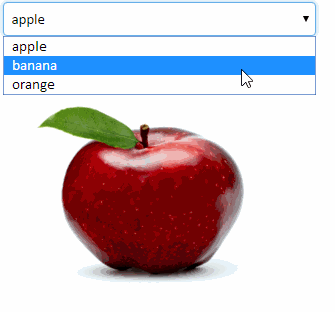
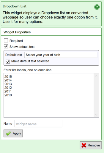
Drop-down lists are used to select between a limited number of choices. The menu opens when you click on it. When you have made your choice, only the selected choice is visible.

Screenshot from the iPhone/Android flavor of the Dropdown widget

You insert a Dropdown list widget by clicking the Dropdown List widget in the Widgets tab in the task pane. List the labels in each line in the empty space. You can then set different properties for the Dropdown List:

  • Required field requires input from the user. This option is mainly used for electronic forms, where a form must contain a minimum of information to be meaningful. For Drop-down lists, the user must move the menu away from the option that is selected by default. If the default option is left selected, it will not be possible to submit the form.
  • Show default text instructs the widget to add a dummy choice at the top of the list that implies that no “real” option has been selected yet – typically it’s is also used as a prompt, as in
    “Rate the course, 4 is the best”.
  • List labels are the possible choices in the menu.
  • Name your widgets if you want to pass data into them from the link to the form (see below). For electronic forms, it is also much easier to process the form if all input fields have names. You can name your fields in the widgets or give them cell names in Excel. Widget names can start with numbers or an underscore, which is required when integrating with products like Salesforce.
  • The default value of a drop-down list is the first choice in the list. To provide a different default value, move one of the other choices to the top of the list.
  • You can select an option in the dropdown widget from the link. Use the format /form.htm?example=Banana. Read more about filling form fields from the link.
  • The basic Dropdown widget can only have one static list of choices. If you need a multi-level menu structure, e.g. select country then city, or want to prepare the list of choices with formulas in the spreadsheet, use the Dynamic Dropdown widget instead.

Screenshot from the iPhone/Android flavor of the settings for the Dropdown widget

Dynamic Dropdown

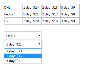
If you want the options in a dropdown menu taken from cells in the spreadsheet, learn more about the Dynamic Dropdown widget.

Screenshot of a dynamic dropdown with dynamically assembled content

Hyperlink and Button

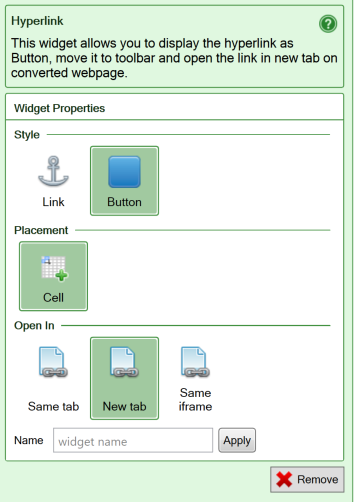
The Hyperlink widget allows you to easily insert links into the converted web page, either as text links or as buttons.

Screenshot from the iPhone/Android flavor of the Hyperlink widget

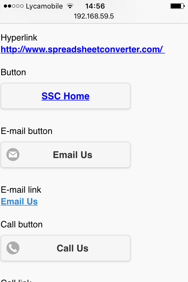
Any cell in your worksheet can contain a web address in the form of a Universal Resource Locator or URL:

An Excel spreadsheet with a URL in that is not converted to a link

Notice that Excel considers this to be just plain text. Nothing will happen if you click on this cell. If you convert this spreadsheet to a web page, the URL is generated as plain text there too, and clicking on it will have no effect.

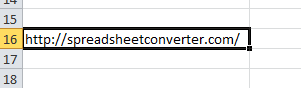
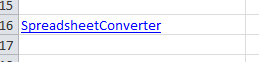
To turn a URL into a working link, you have to insert a hyperlink into the cell. You can let Excel create a hyperlink automatically every time you enter a URL into a cell, or you can use the Insert Hyperlink command:

Inserting a hyperlink in Excel

Notice that the Text to display in the link, often referred to as the link’s anchor text, can be different from the link’s Address. You can usually see that a cell contains a hyperlink anyway, because of its classic formatting in blue with an underline:

A cell in Excel that contains a hyperlink

By default, SpreadsheetConverter preserves hyperlinks on the converted web page. The anchor text will be displayed and linked to the requested URL.

A link in Excel can also be calculated with the

=HYPERLINK(Address, Text to display)

function. In this case the Address portion of the link is assembled dynamically according to the formula you have specified. The URL may be determined conditionally using the IF function or the address assembled from other cells. The Address to use in a given situation can even be selected with the VLOOKUP function from a list of links. The Text to display operand of the Hyperlink function allows you to define the anchor text for the link.

The Hyperlink widget in SpreadsheetConverter provides a few additional useful features:

  • A Style setting that allow you to present the link also as a button, either in the cell or in the SpreadsheetConverter toolbar. The link’s anchor text will be used on the button. The design of the button can be modified by a theme.
  • A Placement setting where you currently only can specify that you want the link or button to be placed in the currently selected cell.
  • An Open In setting that lets you specify how you want the linked page to open: in the same browser tab, in a new browser tab, in the same frame of the web page or in the parent frameset. In the generated HTML, this selection is reflected in the HTML target parameter for the link, which will be omitted, set to _blank, set to _self or set to _parent, respectively.
  • Name your widgets if you want to pass data into them from the link to the form (see the Text field widget above). For electronic forms it is also much easier to process the form if all input fields have names. You can name your fields in the widgets or give them cell names in Excel. Widget names can start with numbers or an underscore, which is required when integrating with products like Salesforce.

Screenshot from the iPhone/Android flavor of the settings for the Hyperlink widget

Email button

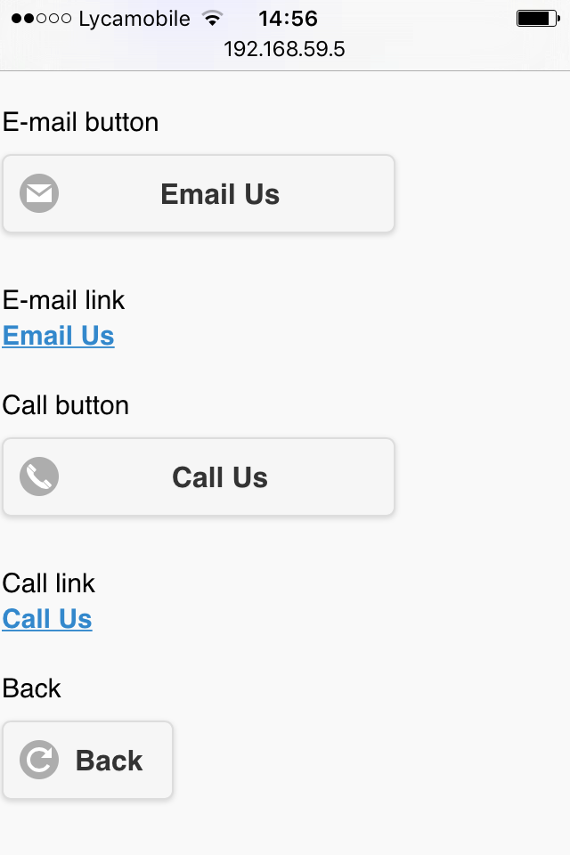
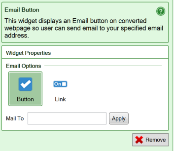
An E-mail Button converts to a mailto (“send an e-mail to this e-mail address”) hyperlink. When the button is pressed, the default e-mail client normally opens a new, empty e-mail with the provided e-mail address as the e-mail recipient. The user enters the Subject and Text for the e-mail, then clicks Send to send the e-mail.

Note that none of this functionality is provided by SpreadsheetConverter. It is up to the user’s web browser to handle mailto links. If the user’s web browser is not properly configured to handle mailto links, the results are unpredictable.

Screenshot from the iPhone/Android flavor of the Email button

The contents of your web form or calculator will not be involved in the processing started by the E-mail Button widget. If you wish to submit the full contents of a form or calculator, configure the web form’s submit options.
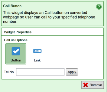
  • Enter the recipient’s e-mail address in the Mail To field. The From field of the new e-mail will normally be set automatically by the e-mail client. All other fields of the new e-mail will be empty.

Screenshot of the settings for the E-mail button widget

Call Button

Call Button converts to a tel (“initiate a telephone call to this number”) hyperlink. When the button is pressed, the device will initiate its normal behavior for tel hyperlinks, which usually is to make a telephone call to the number you have specified.

Note that none of this functionality is provided by SpreadsheetConverter. It is up to the user’s web browser to handle tel links. If the user’s web browser is not properly configured to handle tel links, the results are unpredictable.

Screenshot from the iPhone/Android flavor of the Call button

The contents of your web form or calculator do not participate in the processing started by the Call Button widget, and nothing is sent to the designated telephone number.

  • Enter the number you want the device to call in the Tel No field. The telephony infrastructure may require that you provide the phone number in a specific format. We recommend that you provide both country and area codes to ensure that the telephone number always works, regardless of the user’s location. The telephony infrastructure will usually also provide a Caller ID, i.e. the telephone number that the call originates from.

Screenshot of the settings for the Call button widget

Action Buttons

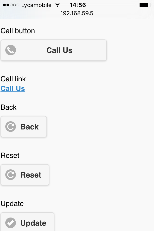
The Submit, Update and Reset buttons are the standard action buttons in your iPhone/Android calculator. That’s why we put them on the most accessible place – at the top of the Side Menu. Touch the “hamburger” in the upper left-hand corner and you see them.

Screenshot from the iPhone/Android flavor of the Action buttons in the Side menu

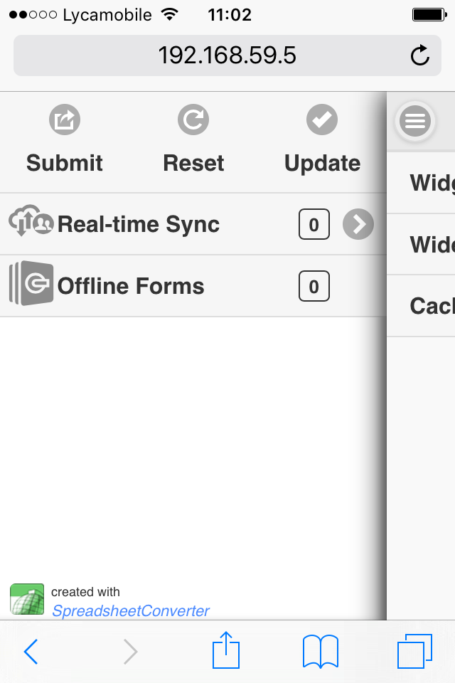
However, sometimes you may want to place an action button elsewhere, perhaps to simplify the user interface. Using widgets, action buttons can be inserted in any cell in the calculator.

The text of all buttons can also be changed. Just type the text you want on the button into the cell where you place the widget.

Screenshot from the iPhone/Android flavor of the Reset, Update and Submit action buttons

Submit Action button

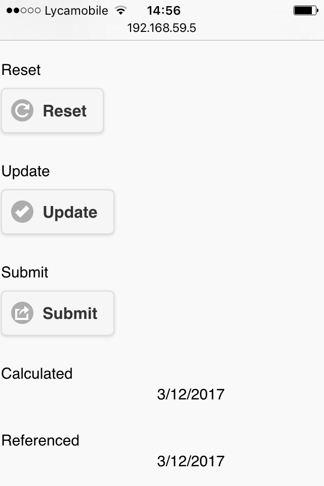
The Submit button send the form to a web server for processing. Insert a Submit button at the end of your long form to save your users from having to scroll back to the top to reach the Submit button in the Side Menu.

Update Action button

For smaller calculators, SpreadsheetConverter automatically updates all cells in a spreadsheet if one of the values is changed, just like Excel does. For a very complex web calculator, you have the option of switching to manual updating of the calculator in the Recalculation method setting on the Workbook tab. In that case, an Update button is needed to manually initiate the updating of the spreadsheet.

You can now place also the Update button in any cell, perhaps right after your most popular input fields.

Reset Action button

The Reset button clears all input fields in a form. It is rarely used, except in situations where a large number of fields contain values that never will be re-used. You can now make the Reset button available where-ever users need it.

Print action button

SpreadsheetConverter supports three printing operations:

  • Print All – prints all worksheets separately.
  • Print This – prints the current worksheet.
  • Print – prints the print sheet if there is one, or the current worksheet.

If you initiate the print operation from the web browser with the Print menu option or the Ctrl-P keyboard shortcut, it corresponds to the Print operation in the list above.

For each Print operation, there is an action button that you can insert into any cell in the spreadsheet.

Hide Rows/Sheets widget

You can hide certain rows in your spreadsheet, and even entire worksheets, depending on the contents of a controlling cell.

hide-rows-action

Learn more about the Hide Rows/Sheets widget. 

File Attachments widget

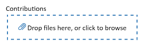
If your users want to include files with their form submissions, e.g. a CV with a job application or an image with an error report, add a File Attachments widget to your form.

Screenshot of the File Attachment widget in a cell

Utility

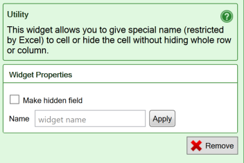
The Utility widget can be used to assign a name to a calculated cell, or to make it invisible.

You insert a Utility widget by clicking the Utility widget in the Widgets tab in the task pane. Utility cells in a form or calculator are always locked for user input in order to preserve the contents

  • Make hidden field is used when you want a cell to be visible in the spreadsheet, but not in the converted web page. This also allows you to provide information to a form processing script without showing it in the form. As an example, if you use a cell to keep track of how long it took a user to fill in a form, you may want to hide this calculation. Even though the field is hidden, it is forwarded with the form when the form is submitted for processing.
  • Name your widgets in electronic forms since it becomes much easier to process the form if all input fields have names. You can name your fields in the widgets or give them cell names in Excel. Widget names can start with numbers or an underscore, which is required when integrating with products like Salesforce.
  • Utility cells get their default values from the formulas in the cell.

Screenshot of the settings for the Utility widget

Learn more

Some of our tutorials partly focus on the Utility widget: