SpreadsheetConverter supports industry-standard responsive web design, a methodology that automatically optimizes the layout of a web page for each screen. If you split your spreadsheet into logical blocks, these can flow nicely across screens of any size. With responsive design, your web pages look great and work well on any kind of device.
More and more web users have small devices with narrow screens. When you create web pages, you must ensure that these can be easily viewed also on mobile devices. Otherwise, your calculator may become difficult to understand or use for some of your most important visitors.

Historically, most spreadsheets were made very wide to fit the desktop screens of long ago. Today, this landscape-oriented design makes old spreadsheets difficult to use on smaller devices that are mostly used with the screen in portrait orientation. The unnecessarily wide layout requires a lot of horizontal scrolling.
With other development tools, you may be forced to create a separate “mobile” version of each spreadsheet. With SpreadsheetConverter you can instead easily divide the spreadsheet into responsive blocks that naturally flow across the screen to fit any screen width.
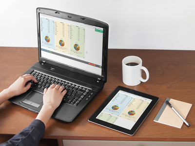
With responsive design, your web calculator or form automatically adapts to different screen widths.
Responsive blocks are easy to use and with little effort make almost any old and wide spreadsheet fit even the smallest screens.
Maintaining separate versions of a spreadsheet for laptops, tablets and phones is time-consuming and complicated. With SpreadsheetConverter you can divide any Excel spreadsheet into Responsive Blocks of any size.
Each responsive block is a rectangular cell area that is always kept together, on all screens, regardless of the screen width.
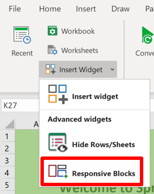
You define responsive blocks in Excel using the Responsive Blocks widget in the SpreadsheetConverter ribbon.
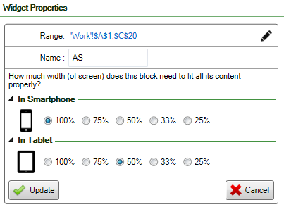
For each responsive block, you specify how much of the screen width to use for the block when it appears on the screen of a phone or tablet. If a block doesn’t fit to the right of the previous block, it appears at the beginning of the next row of blocks.
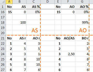
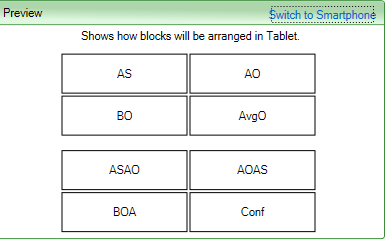
In the screenshot, you can see that the “AS” block requires the full screen width on a phone. On a tablet, however, it is only allocated half the screen width, so if the next block requires 50% or less of the screen width it will fit to the right of the “AS” block if the device is a tablet.
You can create fairly complicated layouts combining blocks of different widths, like
and many other combinations. This lets you adapt the layout of your calculator dynamically to both phones and tablets without having to use separate designs for each device type.
Does this sound complicated? Don’t worry. The Preview function is your best friend. After you’ve split your spreadsheet into responsive blocks, you can preview the automatic layout for both phone and tablet, and adjust your settings if necessary.
When the preview looks good it’s time to convert the spreadsheet for the web and study the results in a web browser.
You don’t need a tablet or phone to verify your responsive design. The layout is responsive already on your laptop and will automatically adapt to any change to the size of your browser window. Just resize the browser window and you will see how the responsive blocks automatically reposition themselves for the new window width.
When you convert the spreadsheet to a web page, your calculator or form uses the responsive blocks to adapt itself to any visitor’s screen in the way that you have defined. Your calculating webpage automatically fits every screen size without horizontal scrolling.
Learn how to edit or delete responsive blocks
Before you create your first responsive spreadsheet, we suggest you read our best practices for responsive blocks to avoid the most common mistakes.