Design for all your visitors

You should design your calculators and forms to work well around the world. It’s easy to forget that many people will view your page on their phones.

Many of the people that will use your form or calculator will be using it on a phone, probably in portrait mode. If you design and test only on your widescreen laptop, you will lose many visitors when they get fed up from scrolling horizontally through your unnecessarily wide layout.

With a global audience, you have to live with a lot of different measurement units, number formats and date/time formats.

To help you design the web page for all your visitors, we created this short checklist.

Design for mobile users

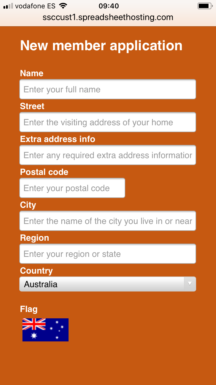
Always design your web pagesto work well also on mobile displays. Use only one- or two-column layouts. Put the caption on top of each field, not to the left of it. Use placeholder text in each field to make it clear what information you expect in the field.

Screenshot of a membership application form shown on an iPhone

Design vertically

Arrange the sections of the calculator or form below each other, or on different tabs. Don’t put new things to the right of old things, put them below.

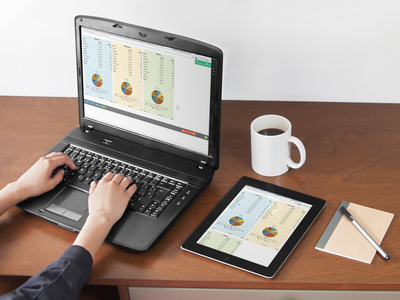
For wider examples, you must use responsive design to make the example fit also narrow screens. In the example below, responsive blocks in the spreadsheet allow three columns on the laptop, two on the tablet and one on the phone.

Photo of a laptop and tablet showing three and two columns of a calculator, respectively     Photo of a man examining a report with responsive design to fit his smartphone

Don’t use tables, use charts or lists

As a desktop user, you may love to analyze data in wide tables with countless columns. This doesn’t work well on phones. You have many options:

  • Visualize your data with a chart instead, or show just the subtotals from the main table.
  • Move the table to a separate worksheet. Link to it from the main page and open it in a separate window – for enthusiasts only.
  • Organize the data vertically, as a list. See the example below how easy it is to make the table easier to read by transposing the columns into rows. It may look boring, but it’s at least much easier to scroll that way.

Screenshot of a wide table     Screenshot of a table turned into a list

Test everything on your own phone

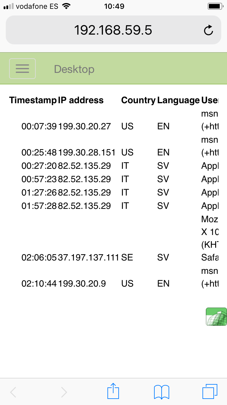
Test every form and calculator also on your own phone, to verify that it looks OK also for mobile users. Which would you rather use on your phone, the old, non-responsive website to the left or the one with responsive design to the right?

Screenshot of our old, non-responsive web page as it looks on an iPhone     Screenshot of new, responsive web page as it looks on an iPhone

Avoid regional differences

Assume your form or calculator will be used by an international audience.

  • People over the world use many different date formats, so avoid using dates in text format if you can. Use a calendar widget to set dates, or separate dropdowns for the year, month and day.
  • Avoid using a 12-hour clock with AM/PM notation. With an international audience, you get fewer mistakes with a 24-hour clock.
  • Avoid using currency symbols like $ or £. You want your calculator to work also for visitors that use a different currency.
  • The natural order of address fields varies between countries. The street number may be before or after the street name, and the postal code can go either before and after the city name.
  • Five countries in the world require a region as part of an address: Australia, Brazil, Canada, Great Britain and the USA. In most other countries, there is no region in the address and therefore you must not make the region field mandatory.
  • Most countries in the world use decimal comma. You can still use a decimal point, of course, but you should be aware of the issue.
  • Most countries use metric units, but some use US customary units like inches, ounces and gallons. Consider offering your users a choice between the two.

Map of countries using the metric system, and countries using US customary units

Use colors that work for everybody

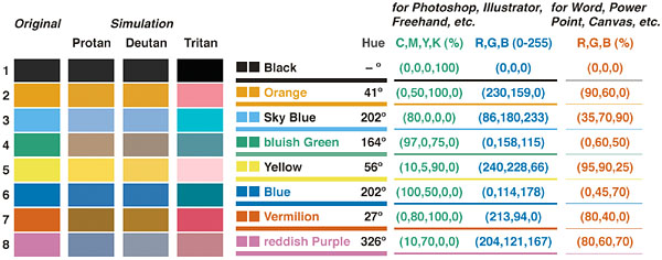
Use only colors that are as far away from each other as possible, using colors that are unambiguous also to colorblind persons. It’s easy to work with this helpful table from https://jfly.uni-koeln.de/color/#pallet.

A table suggesting unambiguous screen colors that work also for the colorblind from http://jfly.iam.u-tokyo.ac.jp/color/#pallet